
ValueSense features - Advanced stock charting
Advanced Stock Charting in ValueSense provides powerful fundamental analysis capabilities, allowing users to visualize, compare, and analyze financial metrics with interactive charts. This feature focuses on fundamental analysis rather than technical price analysis, offering deep insights into company performance through comprehensive financial data visualization.
Accessing Advanced Stock Charting
Navigation Path:
Navigate to any specific company's main analysis page (e.g., Microsoft MSFT summary page)
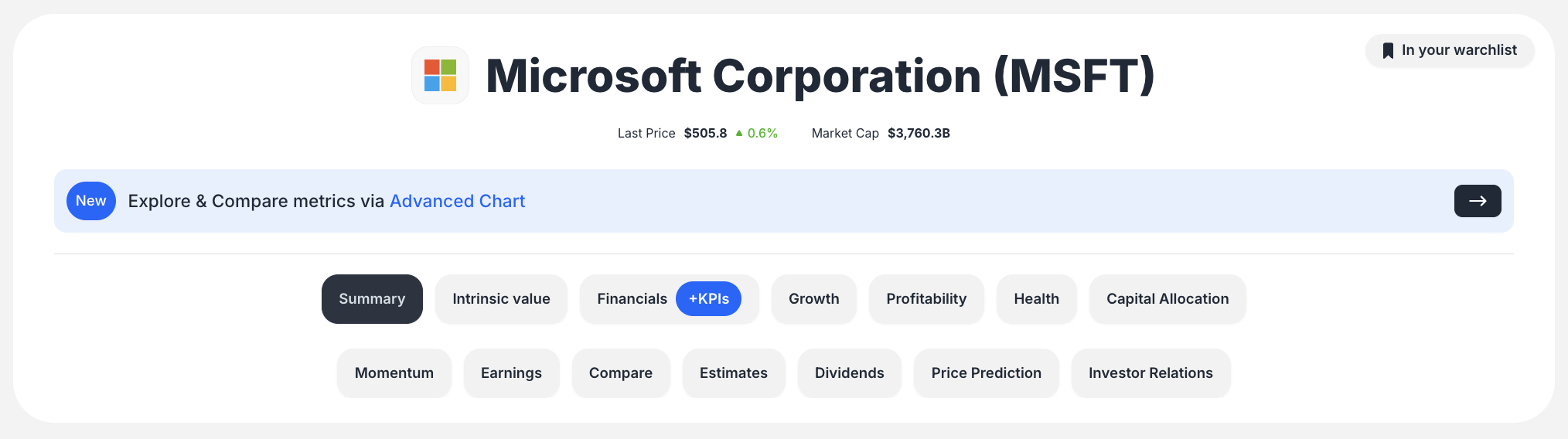
Look for the prominent banner labeled "New Explore & Compare metrics via Advanced Chart"
Click the banner or its associated arrow button
You'll be redirected to the dedicated "Advanced chart" page for that specific stock
Chart Types and Visualization Options
The platform automatically selects appropriate chart types based on the data being visualized:
Available Chart Types:
- Bar Chart: Displays absolute values over time (e.g., Revenue in dollars)
- Line Chart: Shows percentages or ratios (e.g., Gross Margin %, Revenue Growth %, ROIC)
- Combination Chart: Overlays different chart types with dual Y-axes for different units (dollars and percentages)
Example Use Case:
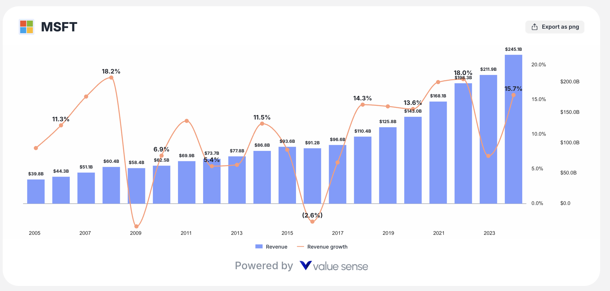
The "Revenue & Growth" preset displays Revenue as a bar chart and Revenue Growth % as a line chart on the same plot, utilizing dual Y-axes for comprehensive analysis.
Analysis Tools and Indicators
ValueSense Advanced Charting focuses on fundamental analysis with preset analysis options:
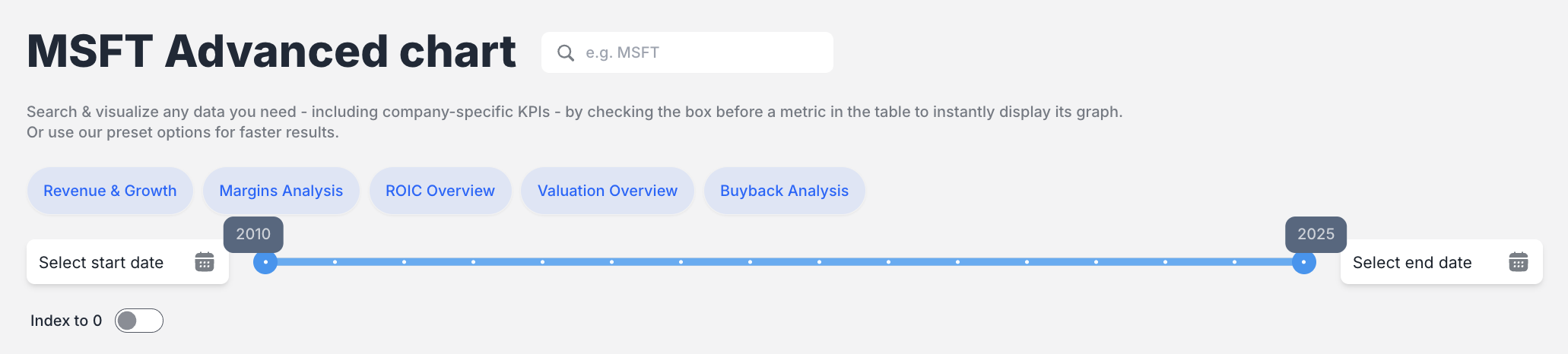
Quick Analysis Presets:
- Revenue & Growth: Visualizes top-line revenue and year-over-year growth rate
- Margins Analysis: Plots key profitability margins (Gross margin, Cash Flow margin)
- ROIC Overview: Compares Return on Invested Capital (ROIC) against Weighted Average Cost of Capital (WACC)
- Valuation Overview: Comprehensive valuation metrics analysis
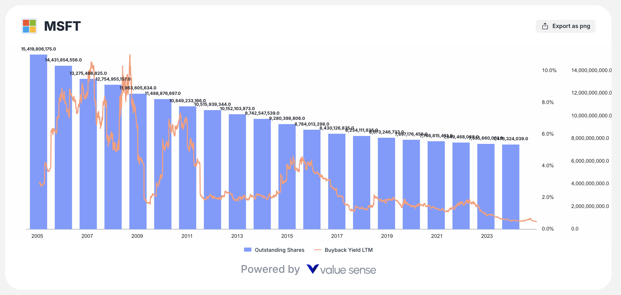
- Buyback Analysis: Share buyback activity and impact analysis
Custom Metric Selection:
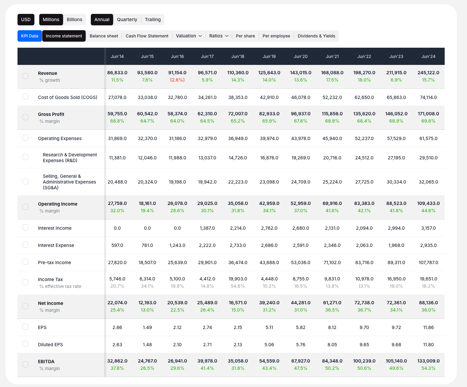
Users can select and plot any available financial metric from the comprehensive data table below the chart.
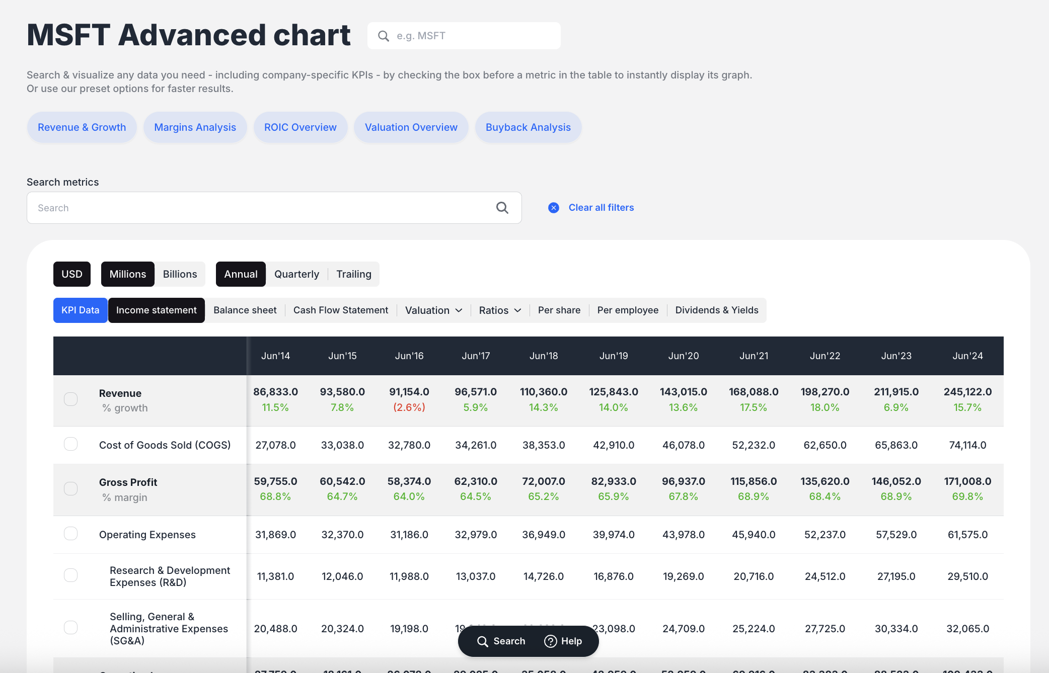
Time Frame Selection and Data Controls
Date Range Management:
- Date Range Slider: Visual slider above the chart allows dragging start and end date markers to focus on specific periods
- Real-time Updates: Chart updates instantly as you adjust the time frame
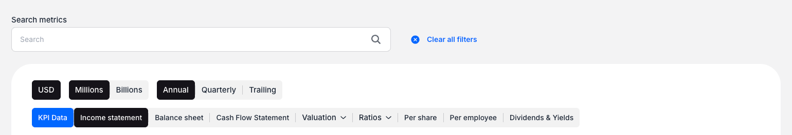
Data Periodicity Options:
Located within the data table section, users can switch between:
- Annual (default view)
- Quarterly (quarterly reporting periods)
- Trailing (TTM - Trailing Twelve Months)
Data Comparison and Overlay Capabilities
This is a core strength of the Advanced Charting feature:
Multi-Metric Plotting:
- Check boxes next to multiple metrics in the data table
- Chart instantly updates to overlay all selected data series
- Example: Plot total "Revenue" (as bars) and "Gaming Revenue" (as smaller, overlaid bars) for segment comparison
Dual-Axis Support:
- Automatically generates second Y-axis when comparing metrics with different units
- Seamlessly handles dollars vs. percentages comparisons
Advanced Data Analysis Features
Granular KPI Data Access:
Users can access and plot highly specific, segmented company data:
- Revenue by specific product lines (e.g., Intelligent Cloud, Gaming, LinkedIn)
- Old vs. New revenue reporting segments
- Business Growth Metrics (e.g., Azure & Other Cloud Services Growth %)
Data View Toggles:
Transform how data is displayed on the chart:
- Values: Absolute numbers
- % YoY Growth: Year-over-year growth rates
- % of Total: Metric's percentage relative to total (e.g., segment revenue as % of total revenue)
- % Margins: Pre-calculated margins
Normalization Features:
- "Index to 0" toggle: Normalizes starting point of line charts for better performance comparison across different metrics
User Interface and Workflow
Key Interface Elements:
- Header: Title and stock search bar
- Preset Buttons: Quick analysis options
- Time Controls: Date range slider
- Chart Canvas: Main visualization area with legend and export functionality
- Data Table/Control Panel: Main interaction hub with periodicity toggles, data view toggles, financial statement tabs, and plottable metrics checklist
Standard Workflow:
- Navigate to Advanced Chart page for desired stock
- Choose either:
- Preset Analysis: Use quick preset buttons for standard views
- Custom Analysis: Scroll to data table for custom metric selection
- In the data table, select financial statement tab (Income Statement, Balance Sheet, KPI Data)
- Check boxes next to desired metrics to plot them
- Chart updates in real-time
- Refine time frame using slider or periodicity toggles
- Export final chart as PNG image
Export and Sharing Features
Export Functionality:
- "Export as PNG" button located in top-right corner of chart area
- Saves static image of current chart view with all selected metrics and time frame
Current Limitations:
- No feature for saving specific chart configurations
- No interactive chart sharing via links (as shown in current version)
Step-by-Step Usage Examples
Example 1: Comparing Revenue Streams
- Access Advanced Chart from company summary page
- Scroll to data table below chart
- Check "Revenue" checkbox
- Scroll down and check "Gaming Revenue" checkbox
- Observe chart updating to show both metrics overlaid
Example 2: Using Analysis Presets
- Click "Margins Analysis" button for margin trends
- Click "ROIC Overview" button for ROIC vs. WACC comparison
- Click "Revenue & Growth" button for combined revenue and growth analysis
Best Practices
Effective Analysis Strategies:
- Start with Presets: Use preset analysis buttons for quick insights
- Layer Your Analysis: Add related metrics to build comprehensive view
- Use Time Controls: Adjust date ranges to focus on specific periods or events
- Leverage Dual Views: Compare absolute values with growth rates for complete picture
- Export Key Insights: Save important chart configurations as PNG files
Data Interpretation:
- Normalize When Comparing: Use "Index to 0" for performance comparisons
- Consider Context: Use different periodicities (Annual, Quarterly, TTM) for different analysis needs
- Segment Analysis: Compare segment performance to total company metrics
This Advanced Stock Charting feature provides ValueSense users with powerful fundamental analysis capabilities, enabling deep insights into company performance through interactive, customizable financial data visualizations.