
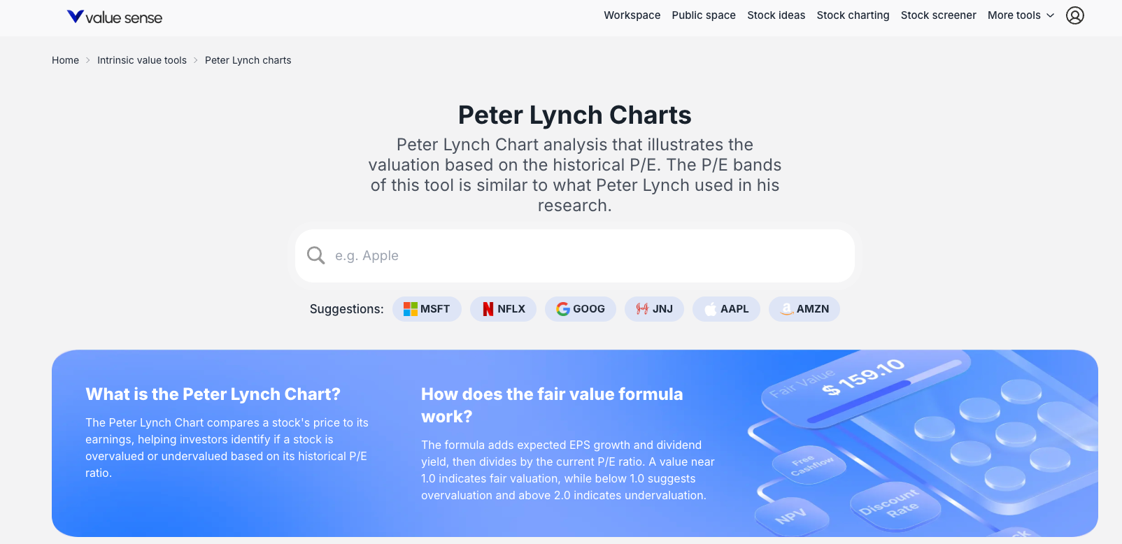
ValueSense Intrinsic Value Tools - Peter Lynch Charts
Peter Lynch Charts provide a quick, visual assessment of a stock's current valuation relative to its own historical performance. This powerful tool compares a stock's market price to valuation bands calculated from its historical Price-to-Earnings (P/E) ratios, helping investors instantly identify if a stock appears overvalued, undervalued, or fairly valued based on its historical P/E range.
Accessing Peter Lynch Charts
From the Value Investing Tools Hub
- Navigate to the main "Intrinsic Value tools" dashboard
- Locate the "Peter Lynch charts" card
- Click on the card (described as "Peter Lynch Chart analysis that illustrates the valuation based on the historical P/E")
- Search for a stock by typing in the search bar or click on suggested tickers (MSFT, AAPL, GOOG)

What Peter Lynch Charts Do
Core Purpose
The charts provide instant visual assessment of stock valuation by comparing current market price to historical P/E-based valuation bands, answering the key question: "Is this stock expensive or cheap relative to its own history?"
Key Benefits
- Quick Visual Assessment: Immediate understanding of valuation status
- Historical Context: Shows how current valuation compares to past levels
- Relative Valuation: Compares company to its own historical performance
- Investment Screening: Identifies potentially undervalued or overvalued opportunities
Chart Components and Visualization
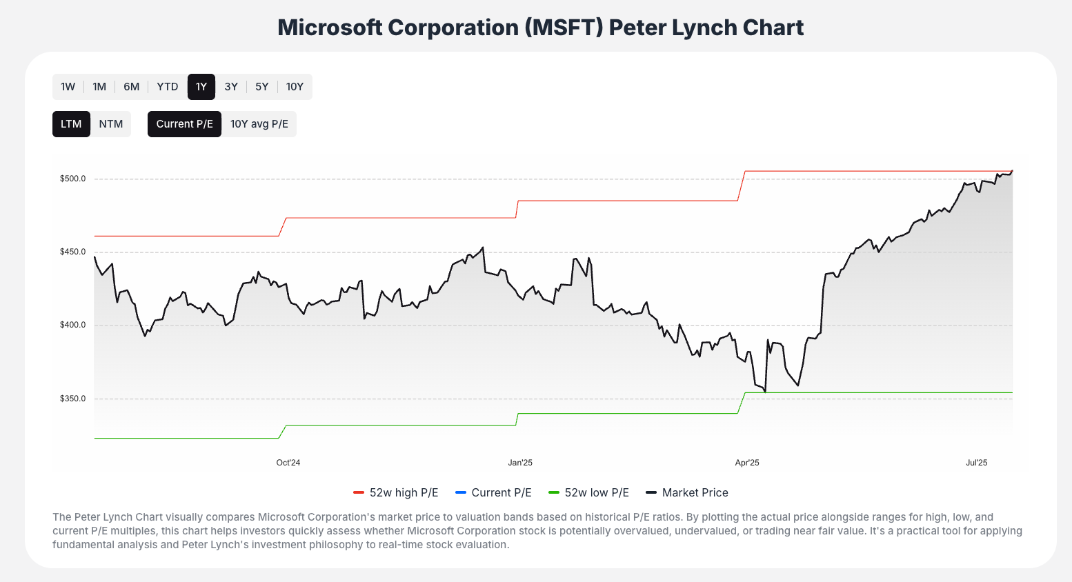
Three-Line Chart System
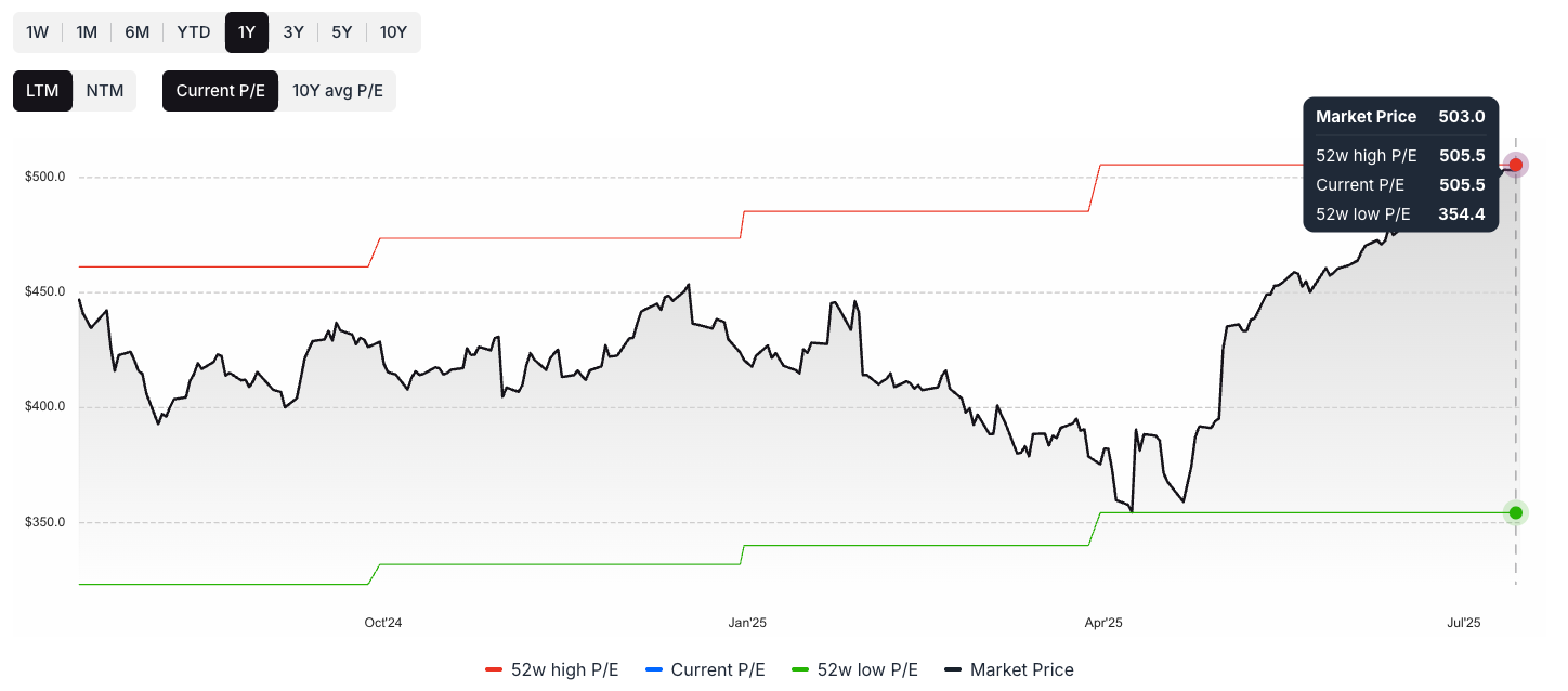
Market Price Line (Black)
- Shows actual stock price movement over selected timeframe
- Represents real market valuation
- Dynamic line that changes with market conditions
52-Week High P/E Band (Red)
- Upper valuation boundary
- Represents stock price if trading at 52-week high P/E ratio
- Indicates potential overvaluation zone
52-Week Low P/E Band (Green)
- Lower valuation boundary
- Represents stock price if trading at 52-week low P/E ratio
- Indicates potential undervaluation zone
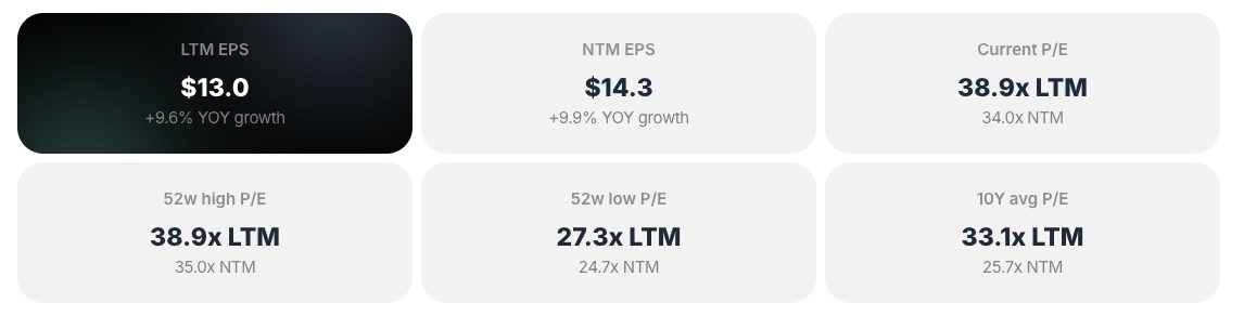
Supporting Data
- Summary Metrics: LTM EPS, NTM EPS, Current P/E ratio
- Interactive Tooltips: Point-in-time data on hover
- Clear Legend: Visual identification of each line's meaning
Interactive Features
Timeframe Selection
- Multiple Periods: 1Y, 3Y, 5Y, 10Y options
- Historical Context: Understand long-term valuation trends
- Flexible Analysis: Choose period most relevant to your investment horizon
Hover Functionality
- Detailed Tooltips: Hover over any chart point for specific data
- Precise Values: Market price, 52w High P/E, Current P/E, 52w Low P/E
- Historical Data: Access exact values for any date
User-Friendly Navigation
- Clean Interface: Logical flow from selection to analysis
- Search Functionality: Find stocks by name or ticker
- Suggested Stocks: Quick access to popular companies
Methodology and Concepts
Peter Lynch's P/E Bands
- Historical Foundation: Based on legendary investor Peter Lynch's approach
- P/E Ratio Analysis: Uses Price-to-Earnings multiples for valuation assessment
- Relative Valuation: Compares company to its own historical norms
- Practical Application: Simplifies complex valuation into visual format
Key Valuation Concepts
- Historical P/E Range: Uses company's own past performance as benchmark
- Earnings-Based Valuation: Focuses on relationship between price and earnings
- Market Sentiment: Reflects how market has historically valued the company
- Cyclical Patterns: Identifies recurring valuation cycles
How to Interpret the Charts
Valuation Assessment
Overvaluation Signal
- Above Red Band: Market price line significantly above high P/E band
- Historical Premium: Trading at higher multiples than historical highs
- Caution Indicator: May suggest expensive valuation
Undervaluation Signal
- Below Green Band: Market price line significantly below low P/E band
- Historical Discount: Trading at lower multiples than historical lows
- Opportunity Indicator: May suggest attractive valuation
Fair Valuation
- Between Bands: Market price line within historical P/E range
- Normal Levels: Trading at typical historical multiples
- Neutral Signal: Neither obviously cheap nor expensive
Advanced Interpretation
- Trend Analysis: Use timeframe selection to understand valuation trends
- Context Consideration: Consider broader market conditions and company changes
- Starting Point: Use as initial assessment, not final investment decision
Key Workflow Steps
Step 1: Access and Select
Navigate to Peter Lynch Charts and choose your target stock
Step 2: Visual Assessment
- Observe market price line (black) position relative to P/E bands
- Identify if stock appears over, under, or fairly valued
- Form initial valuation hypothesis
Step 3: Historical Context
- Use timeframe selectors (1Y, 3Y, 5Y, 10Y) to understand trends
- Assess if current valuation is recent development or long-term pattern
- Consider cyclical patterns and market cycles
Step 4: Detailed Investigation
- Hover over chart points for precise data values
- Examine specific dates and P/E ratios
- Understand valuation evolution over time
Step 5: Cross-Reference Analysis
- Use integrated tools hub to analyze same stock with other methods
- Compare Peter Lynch assessment with DCF, Graham Value, EPV
- Build comprehensive valuation picture
Step 6: Discovery and Expansion
- Explore linked stock screener lists
- Find other potential opportunities
- Apply insights to broader investment strategy
Best Practices
Effective Usage
- Quick Screening: Use for initial valuation assessment
- Historical Context: Always consider multiple timeframes
- Confirm with Other Methods: Cross-reference with other valuation approaches
- Market Conditions: Consider broader economic environment
Interpretation Guidelines
- Trend Over Point: Focus on overall patterns, not single data points
- Company Changes: Consider if business fundamentals have changed
- Earnings Quality: Assess sustainability of earnings driving P/E ratios
- Market Cycles: Understand cyclical vs. secular valuation changes
Limitations to Consider
- Relative Not Absolute: Compares to history, not intrinsic value
- P/E Dependency: Effectiveness depends on earnings quality and consistency
- Market Efficiency: Historical patterns may not predict future performance
- Supplementary Tool: Best used alongside other valuation methods
Key Questions the Tool Answers
- "Is this stock expensive relative to its history?"
- Visual comparison of price to historical P/E bands
- "What's the historical valuation range for this company?"
- Red and green bands show high and low P/E-based valuations
- "Is the current valuation a recent development?"
- Timeframe selection shows evolution of valuation
- "How has the market historically valued this company?"
- Complete historical P/E band analysis
- "Should I investigate this stock further?"
- Initial screening for deeper valuation analysis
Educational Value
Learning Peter Lynch Principles
- Historical Perspective: Understanding how valuations cycle over time
- P/E Ratio Application: Practical use of price-to-earnings analysis
- Visual Learning: Charts make complex concepts accessible
- Market Psychology: Insight into how markets value companies over time
Investment Skill Development
- Valuation Screening: Develop ability to quickly assess opportunities
- Historical Analysis: Learn to use past performance for context
- Multi-Method Approach: Understand importance of diverse valuation tools
- Market Timing: Recognize potential entry and exit points
Peter Lynch Charts transform complex historical valuation analysis into an intuitive, visual tool that helps investors quickly identify potential opportunities while maintaining the analytical rigor that made Peter Lynch one of history's most successful investors.