
ValueSense features - Stock charting
ValueSense's Stock Charting feature is designed for fundamental data analysis and visualization. Unlike traditional technical charting tools that focus on price movements, this powerful feature allows you to chart and compare fundamental financial metrics across multiple companies, providing deep insights into business performance trends.
Getting Started with Stock Charting
Step 1: Access the Stock Charting Feature
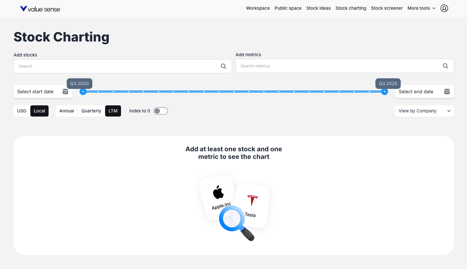
Navigate to the Stock Charting tool by clicking on "Stock charting" in the main navigation bar at the top of the page, located between "Stock ideas" and "Stock screener."
Step 2: Add Stocks to Your Analysis
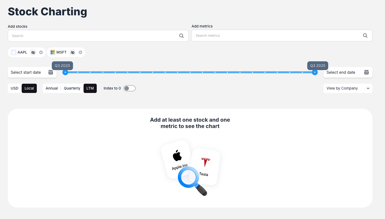
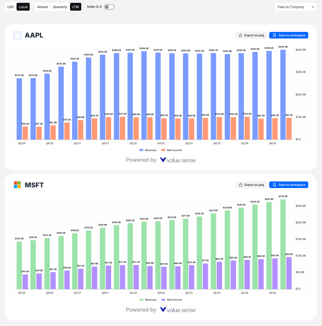
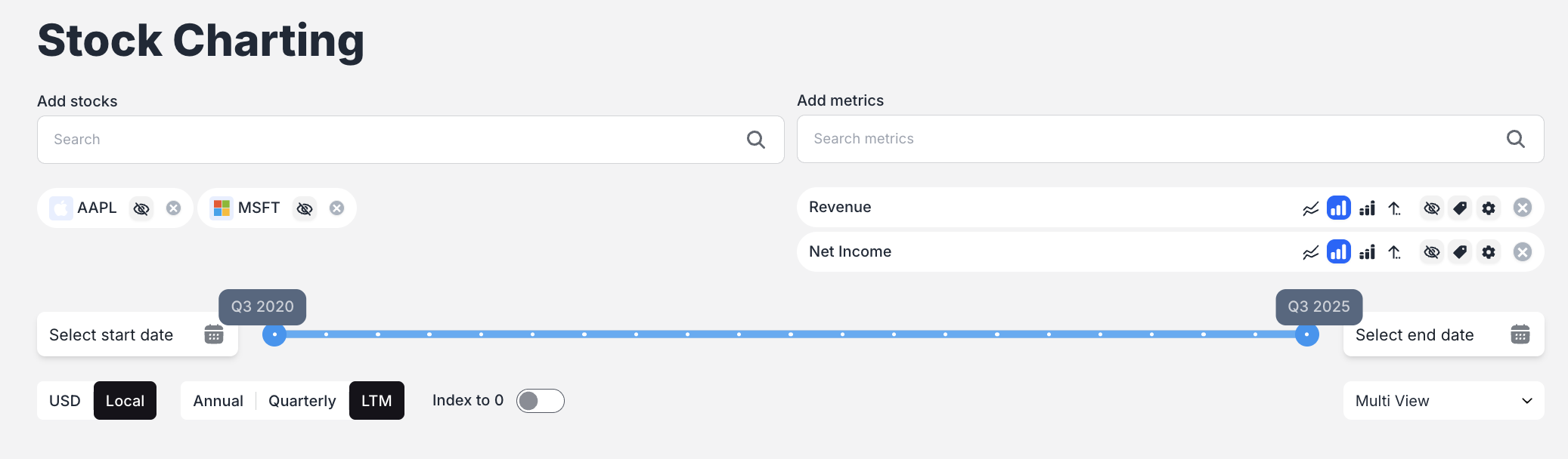
Use the "Add stocks" search bar to find and select companies you want to analyze. Simply type a company name or ticker symbol (e.g., "MSFT" for Microsoft, "AAPL" for Apple) and select from the dropdown results. You can add multiple stocks to create comprehensive comparisons.
Step 3: Select Financial Metrics
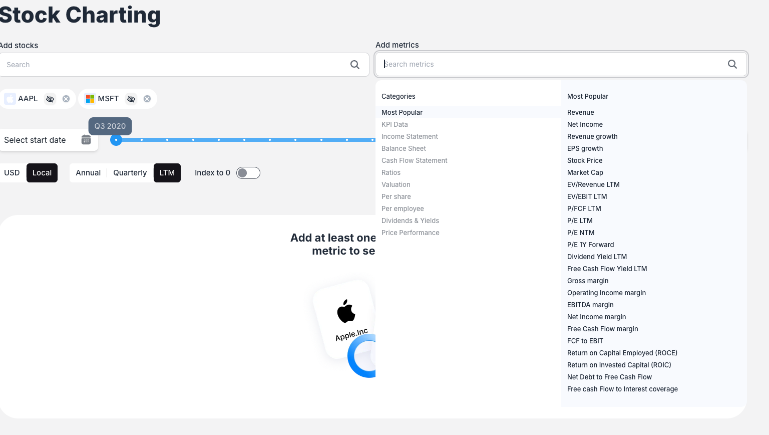
Click the "Add metrics" search bar to choose the fundamental data points you want to chart. The system offers:
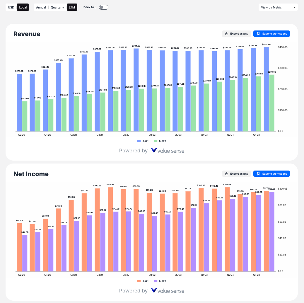
- Most Popular metrics: Common financial indicators like Revenue, Net Income, etc.
- KPI Data: Company-specific key performance indicators (e.g., LinkedIn Revenue for Microsoft)
- Hierarchical categories: Navigate through organized metric categories to find specific data points
Key Charting Features
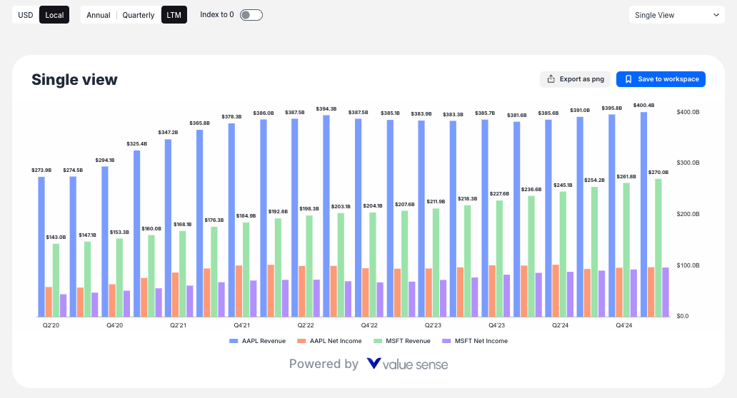
Multiple View Modes
ValueSense offers four distinct view modes to help you analyze your data:
- Single View: Combines all selected metrics for all companies on one unified chart
- View by Company: Creates separate charts for each company, showing all selected metrics
- View by Metric: Creates separate charts for each metric, comparing all selected companies
- Multi View: Creates individual charts for every unique combination of stock and metric
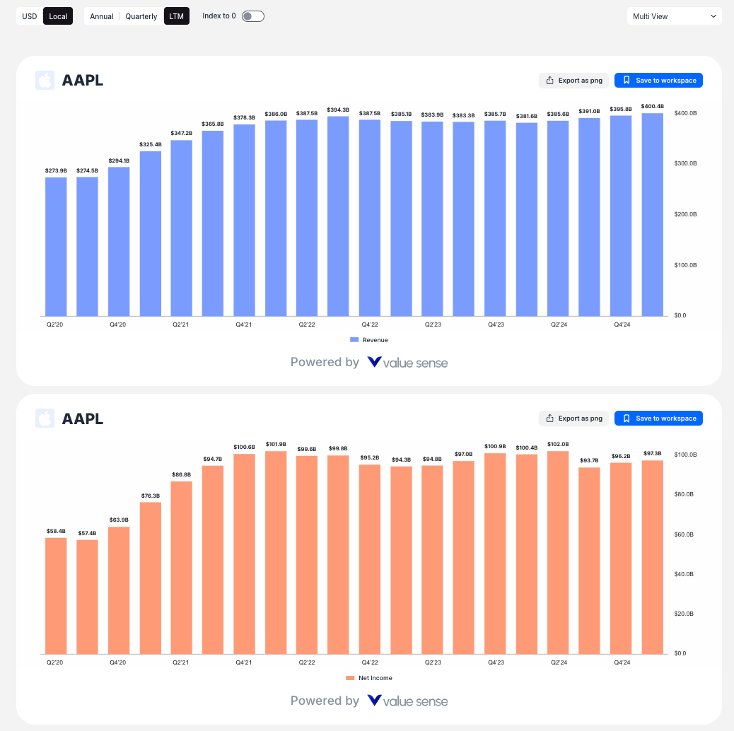
Chart Customization Options
For each metric, you can customize:
- Chart Type: Toggle between Bar Chart and Line Chart display
- Statistical Overlays: Add Average, Median, Min/Max lines to visualize statistical trends
- Secondary Axis: Use dual y-axes for metrics with different scales
- Visibility: Hide or show individual metrics as needed
Advanced Analysis Tools
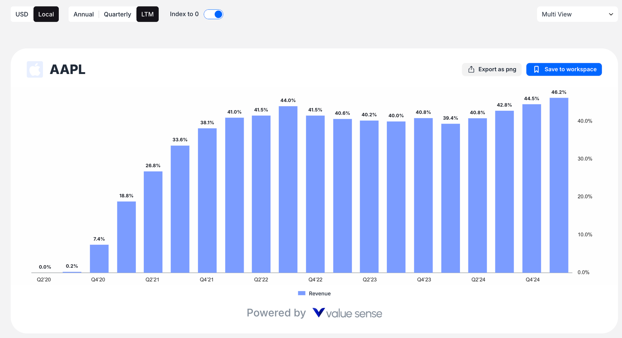
- Index to 0 Normalization: This powerful feature recalculates the Y-axis to show percentage growth from the starting date, allowing you to compare growth rates regardless of absolute values
- Time Controls:

- Interactive date range slider for intuitive time period selection
- Calendar date pickers for precise date selection
- Period buttons (Annual, Quarterly, LTM) to adjust data frequency
- Currency Options: Toggle between USD and Local currency display
Export and Save Options
Every chart includes:
- Export as PNG: Download charts as image files for presentations or reports
- Save to workspace: Store your analysis for future reference and collaboration
Key Advantages
- Fundamental Focus: Analyze business performance metrics, not just price movements
- Multi-company Comparison: Compare multiple companies' performance side by side
- Flexible Time Analysis: View data annually, quarterly, or over the last twelve months
- Statistical Insights: Apply statistical overlays to identify trends and patterns
- Growth Rate Analysis: Use Index to 0 to normalize and compare growth trajectories
Pro Tips
- Start with popular metrics like Revenue and Net Income to get familiar with the interface
- Use "View by Metric" mode to compare how different companies perform on the same financial measure
- Apply the "Index to 0" feature when comparing companies of different sizes to focus on growth rates rather than absolute values
- Combine quarterly and annual views to understand both short-term trends and long-term performance
This charting tool is ideal for fundamental analysts, investors, and anyone looking to understand the underlying business performance trends that drive stock valuations.